pacman::p_load(tidyverse, ggHoriPlot, ggthemes)Hands-on Exercise 07b - Time on the Horizon: ggHoriPlot methods
1. Overview
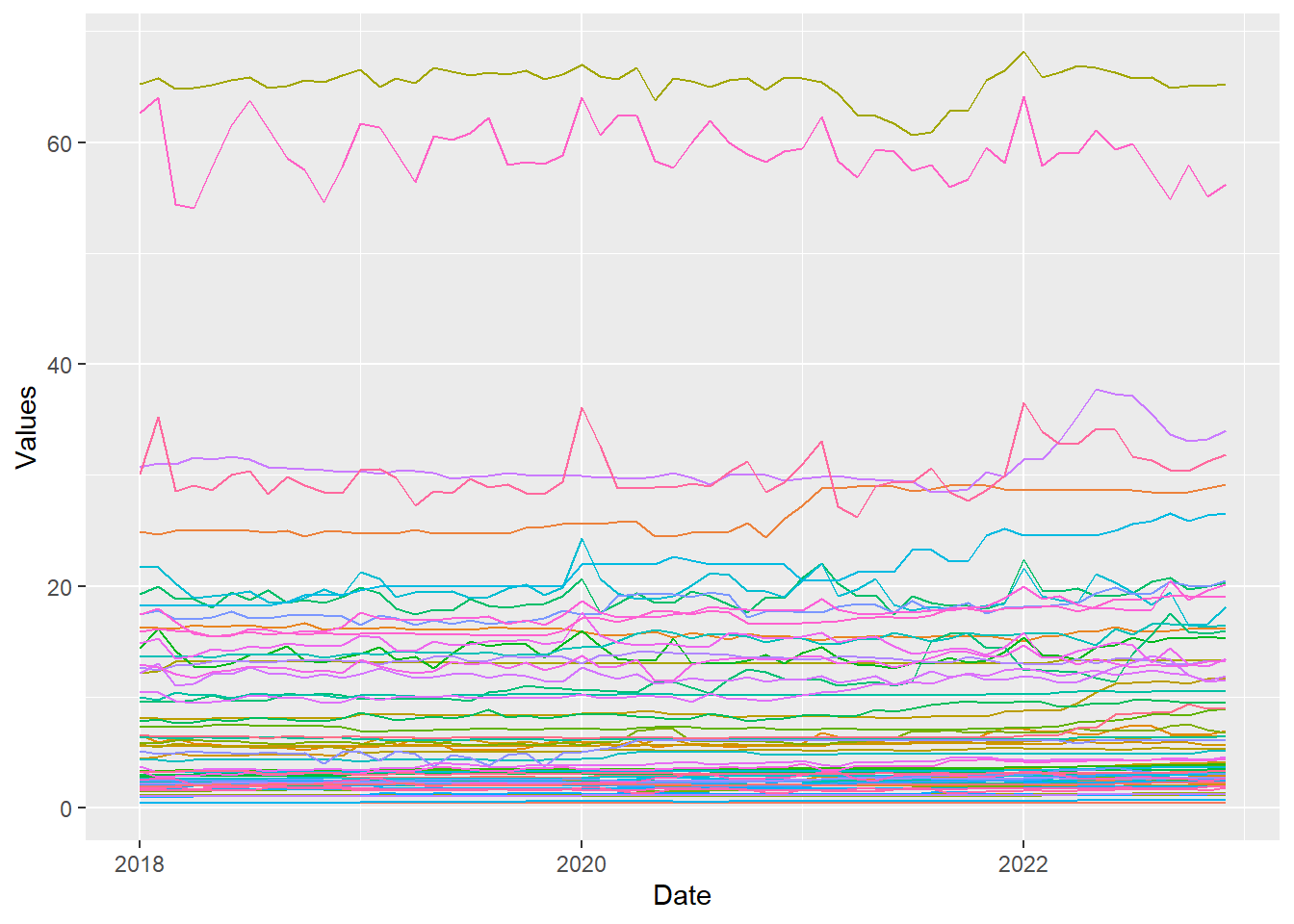
A horizon graph is an analytical graphical method specially designed for visualising large numbers of time-series. It aims to overcome the issue of visualising highly overlapping time-series as shown in the figure below.
A horizon graph essentially an area chart that has been split into slices and the slices then layered on top of one another with the areas representing the highest (absolute) values on top. Each slice has a greater intensity of colour based on the absolute value it represents.
In this section, we will learn how to plot a horizon graph by using ggHoriPlot package.
Tip
Before getting started, please visit Getting Started to learn more about the functions of ggHoriPlot package. Next, read geom_horizon() to learn more about the usage of its arguments.
2. Getting Started
Before getting start, make sure that ggHoriPlot has been included in the pacman::p_load(…) statement above.
Note that lubridate is already part of tidyverse package hence there is no need to load it again.
2.1. Step 1: Data Import
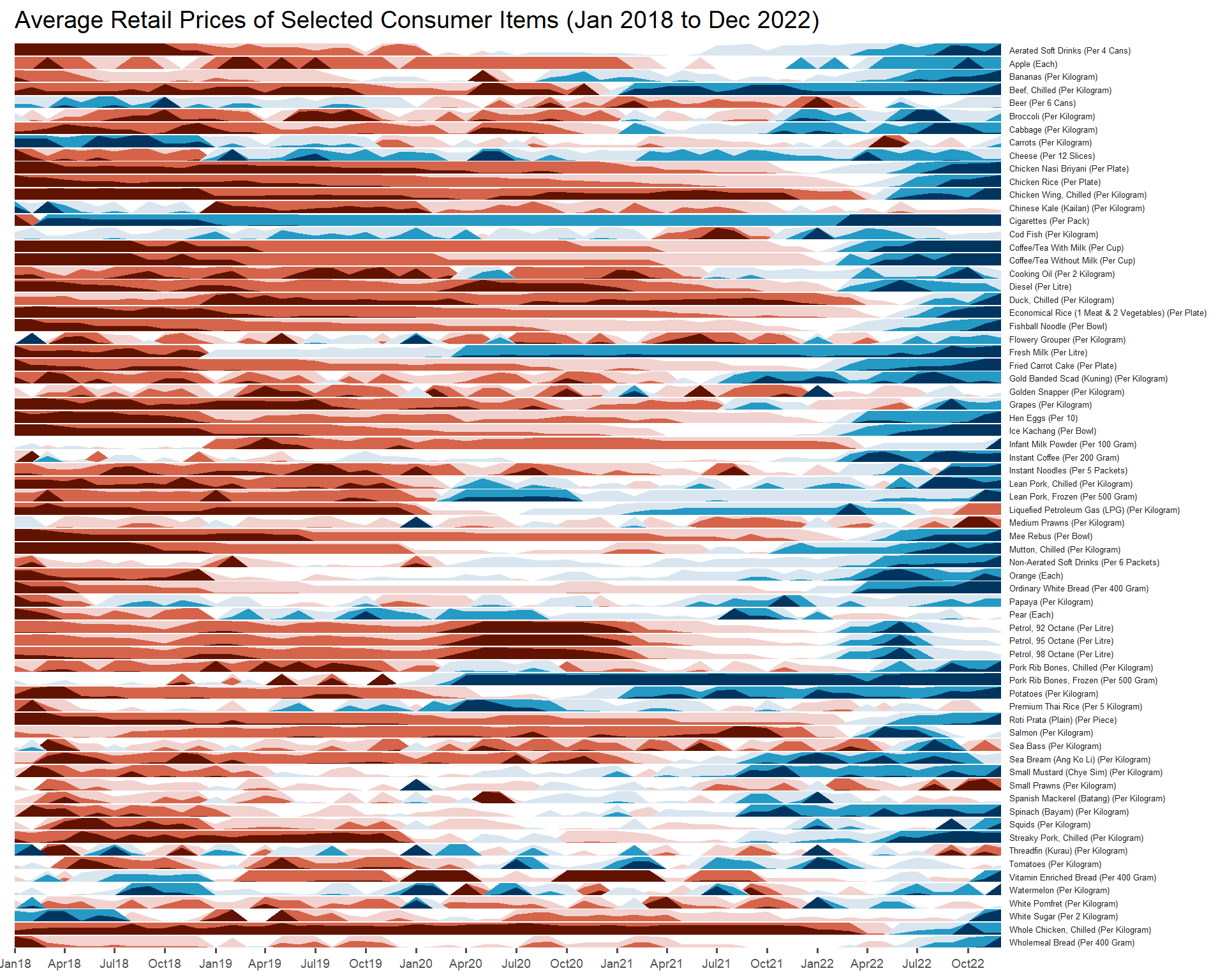
For the purpose of this hands-on exercise, Average Retail Prices Of Selected Consumer Items will be used.
Use the code chunk below to import the AVERP.csv file into R environment.
averp <- read_csv("data/AVERP.csv") averp <- averp %>%
mutate(`Date` = dmy(`Date`))2.2. Step 2: Plotting the horizon graph
Next, the code chunk below will be used to plot the horizon graph.
averp %>%
  filter(Date >= "2018-01-01") %>%
  ggplot() +
  geom_horizon(aes(x = Date, y=Values),
               origin = "midpoint",
               horizonscale = 6)+
  facet_grid(`Consumer Items`~.) +
    theme_few() +
  scale_fill_hcl(palette = 'RdBu') +
  theme(panel.spacing.y=unit(0, "lines"), strip.text.y = element_text(
    size = 5, angle = 0, hjust = 0),
    legend.position = 'none',
    axis.text.y = element_blank(),
    axis.text.x = element_text(size=7),
    axis.title.y = element_blank(),
    axis.title.x = element_blank(),
    axis.ticks.y = element_blank(),
    panel.border = element_blank()
    ) +
    scale_x_date(expand=c(0,0), date_breaks = "3 month", date_labels = "%b%y") +
  ggtitle('Average Retail Prices of Selected Consumer Items (Jan 2018 to Dec 2022)')
Things to learn from the code chunk above
- Those codes with
element_blank()can be removed cos it is just placed there to ‘remind’ you what are the arguments available in ggHoriPlot package.