Show the codes
pacman::p_load(tidyverse, plotly, gganimate, ggiraph, ggdist,
ggstatsplot, ggridges, viridis, ggrepel, ggpubr, extrafont)City of Engagement, with a total population of 50,000, is a small city located at Country of Nowhere. The city serves as a service centre of an agriculture region surrounding the city. The main agriculture of the region is fruit farms and vineyards. The local council of the city is in the process of preparing the Local Plan 2023. A sample survey of 1000 representative residents had been conducted to collect data related to their household demographic and spending patterns, among other things. The city aims to use the data to assist with their major community revitalization efforts, including how to allocate a very large city renewal grant they have recently received.
In this Take-Home Exercise, we will reveal the demographic and financial characteristics of the city of Engagement by using appropriate static and interactive statistical graphics methods, to help the city managers and planners to explore the complex data in an engaging way and reveal hidden patterns.
Two (2) datasets will be used, as inputs:
The required R library packages are being loaded. For this exercise, we will make use of the following R library packages.
tidyverse, a family of modern R packages specially designed to support data science, analysis and communication task including creating static statistical graphs.
plotly, R library for plotting interactive statistical graphs.
gganimate, an ggplot extension for creating animated statistical graphs.
ggiraph for making ‘ggplot’ graphics interactive.
ggdist for visualizing distributions and uncertainty.
ggstatsplot for creating graphics with details from statistical tests
ggridges, a ggplot2 extension specially designed for plotting ridgeline plots
viridis allows you to generate color palettes based on the viridis scheme
ggrepel provides geoms for ggplot2 to repel overlapping text labels
ggpubr provides a convenient interface for creating publication-ready plots using the ggplot2 package
extrafont makes it easier to use fonts other than the basic PostScript fonts that R uses.
The code chunk below uses pacman::p_load() to check if the above packages are installed. If they are, they will be loaded into the R environment.
pacman::p_load(tidyverse, plotly, gganimate, ggiraph, ggdist,
ggstatsplot, ggridges, viridis, ggrepel, ggpubr, extrafont)We will first load each of the data files into the environment and perform data wrangling, before merging them into 1 single data frame by based on the ‘participantId’ column.
Participants.csvImport data from csv using readr::read_csv() and store it in variable participants_raw.
# Load the Participants.csv into the environment
participants_raw <- read_csv("data/Participants.csv")As part of the data wrangling process, we will also check the data set for duplicate records and remove them (if there is any).
# Check if 'participants' contains any duplicate rows
has_duplicates <- any(duplicated(participants_raw))

if (has_duplicates) {
  # contains duplicate rows
  # extracting only the unique participants records
  participants <- distinct(participants_raw)
} else {
  # No duplicate rows
  # since there are no duplicate rows, we will just replicate participants data for consistency
  participants <- participants_raw
}
participants
# A tibble: 1,011 × 7
participantId householdSize haveKids age educationLevel interestGroup
<dbl> <dbl> <lgl> <dbl> <chr> <chr>
1 0 3 TRUE 36 HighSchoolOrCollege H
2 1 3 TRUE 25 HighSchoolOrCollege B
3 2 3 TRUE 35 HighSchoolOrCollege A
4 3 3 TRUE 21 HighSchoolOrCollege I
5 4 3 TRUE 43 Bachelors H
6 5 3 TRUE 32 HighSchoolOrCollege D
7 6 3 TRUE 26 HighSchoolOrCollege I
8 7 3 TRUE 27 Bachelors A
9 8 3 TRUE 20 Bachelors G
10 9 3 TRUE 35 Bachelors D
# ℹ 1,001 more rows
# ℹ 1 more variable: joviality <dbl>Looking at the participants data set above, we notice that there are a few problems that we need to resolve before we can perform analysis on them
<dbl> format. Since this is used to identify each participant uniquely, we will convert it to a string factor<chr> format. We will convert it to a string factor<dbl> format. We will convert it to <int> format since it should be a whole number.<lgl> format and has value of TRUE and FALSE, which are not very intuitive. We will change it to YES and NO instead.<dbl> format. We will convert it to <int> format since it should be a whole number.age and joviality for analysis purposes.# Convert participantId, educationLevel columns into string factor
participants$participantId <- as.factor(as.character(participants$participantId))
participants$educationLevel <- as.factor(as.character(participants$educationLevel))
# Convert householdSize and age into whole numbers, i.e. integers
participants$householdSize <- as.integer(participants$householdSize)
participants$age <- as.integer(participants$age)
# Replace `TRUE` to `YES` and `FALSE` to `NO` for haveKids column
participants$haveKids <- ifelse(participants$haveKids == "TRUE", "YES",
participants$haveKids)
participants$haveKids <- ifelse(participants$haveKids == "FALSE", "NO",
participants$haveKids)
# Convert joviality column into a double data type and round it to 2 decimal places
participants$joviality <- as.double(participants$joviality)
# Bin the age column into groupings and save into another column, age_bin
participants <- participants %>% mutate(age_bin = cut(age, breaks=c(17, 30, 40, 50, 60)))
# Bin the joviality column into broad categories and save into another column, jov_bin
participants <- participants %>%
mutate(jov_bin = cut(joviality, breaks=c(0, 0.2, 0.4, 0.6, 0.8, 1.0)))FinancialJournal.csvImport data from csv using readr::read_csv() and store it in variable finjournal_raw.
# Load the FinancialJournal.csv into the environment
finjournal_raw <- read_csv("data/FinancialJournal.csv")As part of the data wrangling process, we will also check the data set for duplicate records and remove them (if there is any).
# Load the FinancialJournal.csv into the environment
finjournal_raw <- read_csv("data/FinancialJournal.csv")

# Check if 'finjournal' contains any duplicate rows
has_duplicates <- any(duplicated(finjournal_raw))

if (has_duplicates) {
  # contains duplicate rows

  # Remove duplicate records from the 'finjournal_raw' data frame
  finjournal <- distinct(finjournal_raw)
} else {
  # No duplicate rows
  # if there are no duplicate rows, we will just replicate finjournal_raw data for consistency
  finjournal <- finjournal_raw
}
finjournal
# A tibble: 1,512,523 × 4
participantId timestamp category amount
<dbl> <dttm> <chr> <dbl>
1 0 2022-03-01 00:00:00 Wage 2473.
2 0 2022-03-01 00:00:00 Shelter -555.
3 0 2022-03-01 00:00:00 Education -38.0
4 1 2022-03-01 00:00:00 Wage 2047.
5 1 2022-03-01 00:00:00 Shelter -555.
6 1 2022-03-01 00:00:00 Education -38.0
7 2 2022-03-01 00:00:00 Wage 2437.
8 2 2022-03-01 00:00:00 Shelter -557.
9 2 2022-03-01 00:00:00 Education -12.8
10 3 2022-03-01 00:00:00 Wage 2367.
# ℹ 1,512,513 more rowsLooking at the finjournal data set above, we noticed that there are a few problems that we need to resolve before we can perform analysis on them
<dbl> format. Since this is used to identify each participant uniquely, we will convert it to a string factor<POSIXct> format. For the purpose of analysis, we will extract the month and year from this data item.<chr> format. We will convert it to a string factor# Convert participantId, category columns into string factor
finjournal$participantId <- as.factor(as.character(finjournal$participantId))
finjournal$category <- as.factor(as.character(finjournal$category))
# Extract the date component from timestamp column
finjournal$date <- as.Date(finjournal$timestamp)
# Extract the month and year from the date component
finjournal$YearMonth <- format(finjournal$date, "%Y-%m")
# Convert the negative amount values to absolute values and round to 2 decimal places
finjournal$amount <- round(abs(finjournal$amount), 2)There are often dirty data that we will need to cleanse before performing any data analysis. This portion will check on the quality of the financial journal data.
# group the finjournal data by participantId and get the transaction count
# for each participant. We will also arrange the transaction count in
# ascending order.
finjournal_grp <- finjournal %>%
  group_by(participantId) %>%
  summarise(transaction_cnt = n()) %>%
  arrange(transaction_cnt)

# Plotting a histogram with the data extracted for better visualisation
plot <- ggplot(data = finjournal_grp,
               aes(x = transaction_cnt)) +
  geom_histogram(color="gray30", fill="deepskyblue3") +
  ylim(0, 150) +
  ggtitle("Distribution of Transactions by Participants") +
  xlab("Transaction Count") +
  ylab("Number of Participants") +
  theme_light() +
  theme(plot.title = element_text(hjust = 0.5, face="bold"),
        axis.title.x = element_text(face = "bold"),
        axis.title.y = element_text(face = "bold"))

plot <- ggplotly(plot, tooltip = c("y"))

plotAs you noticed from the chart above, there is a number of participants (131 of them in total), who have a significantly low number of transaction records, which is far off from the main distribution. As such, we will treat these as outliers and remove them from our analysis.
We will proceed to remove the 131 participants who have significantly low number of transaction records, compared to the rest.
# Since we have arrange the number of transactions in ascending order in the
# earlier code chunks, we can just get the transaction count for the last
# record of the 131 outliers.
txn_count <- finjournal_grp[131, "transaction_cnt"]

# Extract the participants without the 131 participants by the transaction count
finjournal_grp_filtered <- finjournal_grp %>%
  filter(transaction_cnt > as.integer(txn_count))

# Remove the 131 participants from the finjournal
finjournal_filtered <- merge(finjournal, finjournal_grp_filtered, by = "participantId")In this section, we will be performing a series of data wrangling activities for each participant:
NA values to 0# Group the new filtered dataset by ParticipantId, Category and YearMonth, then
# sum up all the daily transactions amount based on the respective categories
final_finjournal <- finjournal_filtered %>%
group_by(participantId, category, YearMonth) %>%
summarise(Total = sum(amount))
# Transpose the categories to columns
final_finjournal_wide <- pivot_wider(final_finjournal,
names_from = category,
values_from = Total)
# Replace all the NA values to 0
final_finjournal_wide[is.na(final_finjournal_wide)] <- 0.0
# Derive the total monthly expenses, total monthly earnings (income),
# monthly savings, % of monthly expenses (over monthly income)
# for each participant
final_finjournal_wide$sum_expense <- final_finjournal_wide$Education +
final_finjournal_wide$Food +
final_finjournal_wide$Recreation +
final_finjournal_wide$Shelter
final_finjournal_wide$sum_earning <- final_finjournal_wide$Wage +
final_finjournal_wide$RentAdjustment
final_finjournal_wide$saving <- final_finjournal_wide$sum_earning -
final_finjournal_wide$sum_expense
final_finjournal_wide$expense_percent <-
round(final_finjournal_wide$sum_expense/final_finjournal_wide$sum_earning*100, 2)
final_finjournal_wide$YearMthDay <-
as.Date(paste0(final_finjournal_wide$YearMonth,"-01"))We will aggregate all the monthly transactions by participants, since final_finjournal will contain the detailed YearMonth for each participant.
# To have 1 financial journal record per participant

final_finjournal_single <- final_finjournal_wide %>%
  group_by(participantId) %>%
  summarise(Total_Edu = sum(Education),
            Total_Food = sum(Food),
            Total_Rec = sum(Recreation),
            Total_Shelter = sum(Shelter),
            Total_Wage = sum(Wage),
            Total_RentAdj = sum(RentAdjustment),
            Total_sumExp = sum(sum_expense),
            Total_sumEarn = sum(sum_earning),
Total_saving = sum(saving))We will combine the finalised data sets of Participants and FinancialJournal into 1 single data frame for ease of analysis.
For the purpose of different analysis to be performed, we will create 2 sets of merged data:
single_merged_data will have 1 row of record per participantexpanded_merged_data will comprise of a breakdown of the transactions by month for each participant# Merge the two files based on the 'participantId' column
single_merged_data <- merge(participants,
final_finjournal_single,
by = "participantId")
# expanded_merged_data contains a breakdown of the monthly transactions for each participant
expanded_merged_data <- merge(participants, final_finjournal_wide, by = "participantId")The demography of the representative residents are as shown in the graphs below.
Design Consideration Pie charts are used to represent data as a proportion or percentage of a whole. They are useful when we want to show how different categories contribute to the overall total or when we want to compare the size of different categories.
In this case, we make use of pie chart to show the education level composition of the representative residents (in %). Different colours are also used to represent the different levels of education for easy reference. We also make use of callout extensions (through ggrepel to show the %). The same colour scheme is applied to the callout boxes for easy association.
# create a pie chart to show the proportion of education level across the participants

edu_count  <- single_merged_data %>%
  group_by(educationLevel) %>%
  summarize(count = n()) %>%
  mutate(edu_pie_pct = round(count/sum(count)*100)) %>%
  mutate(ypos_p = rev(cumsum(rev(edu_pie_pct))),
         pos_p = edu_pie_pct/2 + lead(ypos_p,1),
         pos_p = if_else(is.na(pos_p), edu_pie_pct/2, pos_p))

ggplot(edu_count,
       aes(x = "" , y = edu_pie_pct,
           fill = fct_inorder(educationLevel))) +
  geom_col(width = 1, color = 1) +
  coord_polar(theta = "y") +
  scale_fill_brewer(palette = "Set2") +
  geom_label_repel(data = edu_count,
                   aes(y = pos_p, label = paste0(edu_pie_pct, "%")),
                   size = 4.5, nudge_x = 1, color = c(1, 1, 1, 1),
                   show.legend = FALSE) +
  guides(fill = guide_legend(title = "Education Level")) +
  labs(title = "Proportion of Education Level")+
  xlab("") + ylab("") +
  theme(legend.position = "bottom",
        plot.title = element_text(hjust = 0.5))+
  theme_void()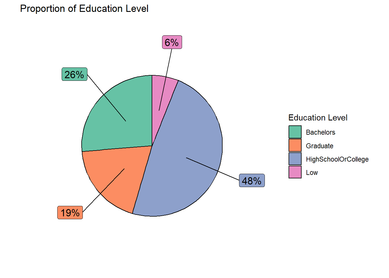
Explanation Of the total sample size of 880 (after removing the outliers), 45% of them have a Bachelor degree and above education, while the remaining representative residents have lower education of High School/College and below.
Design Consideration We make use of bar chart to show the breakdown of the representative residents’ age instead of pie chart so that we can compare the different age groups side-by-side. Besides the % of composition, the number of representative residents belonging to the respective age groups, are also included.
Different colours are also used to represent the different age groups for easy reference. We also make use of callout extensions above the vertical bars (through ggrepel to show the number of representative residents and the %). The same colour scheme is applied to the callout boxes for easy association. The label of the x-axis ticks were amended for better clarity. In addition, the legend box was excluded as label ticks on the x-axis would have indicated the different groups.
# create a bar chart to show the proportion of age across the representative residents
age_count  <- single_merged_data %>%
  group_by(age_bin) %>%
  summarize(count = n()) %>%
  mutate(age_pct = round(count/sum(count)*100)) %>%
  mutate(ypos_p = rev(cumsum(rev(age_pct))),
         pos_p = age_pct/2 + lead(ypos_p,1),
         pos_p = if_else(is.na(pos_p), age_pct/2, pos_p))

ggplot(age_count,
       aes(x = fct_inorder(age_bin) , y = count,
           fill = fct_inorder(age_bin))) +
  geom_bar(stat = "identity", width = 0.5, color = "black") +
  scale_fill_brewer(palette = "Set2") +
  geom_label_repel(data = age_count,
                   aes(label = paste0(count, "(", age_pct, "%)")),
                   size = 4, nudge_x = c(0.1, 0.1, 0.1, 0.1),
                   nudge_y = c(0, 0.1, 0.1, 0.1),
                   color = "grey20",
                   show.legend = FALSE) +
  guides(fill = FALSE) +
  labs(title = "Proportion of Representative Residents by Age Group") +
  xlab("Age Group") + ylab("Count") +
  scale_x_discrete(labels = c("30 and below", "31-40", "41-50", "Over 50")) +
theme(plot.title = element_text(hjust = 0.5)) 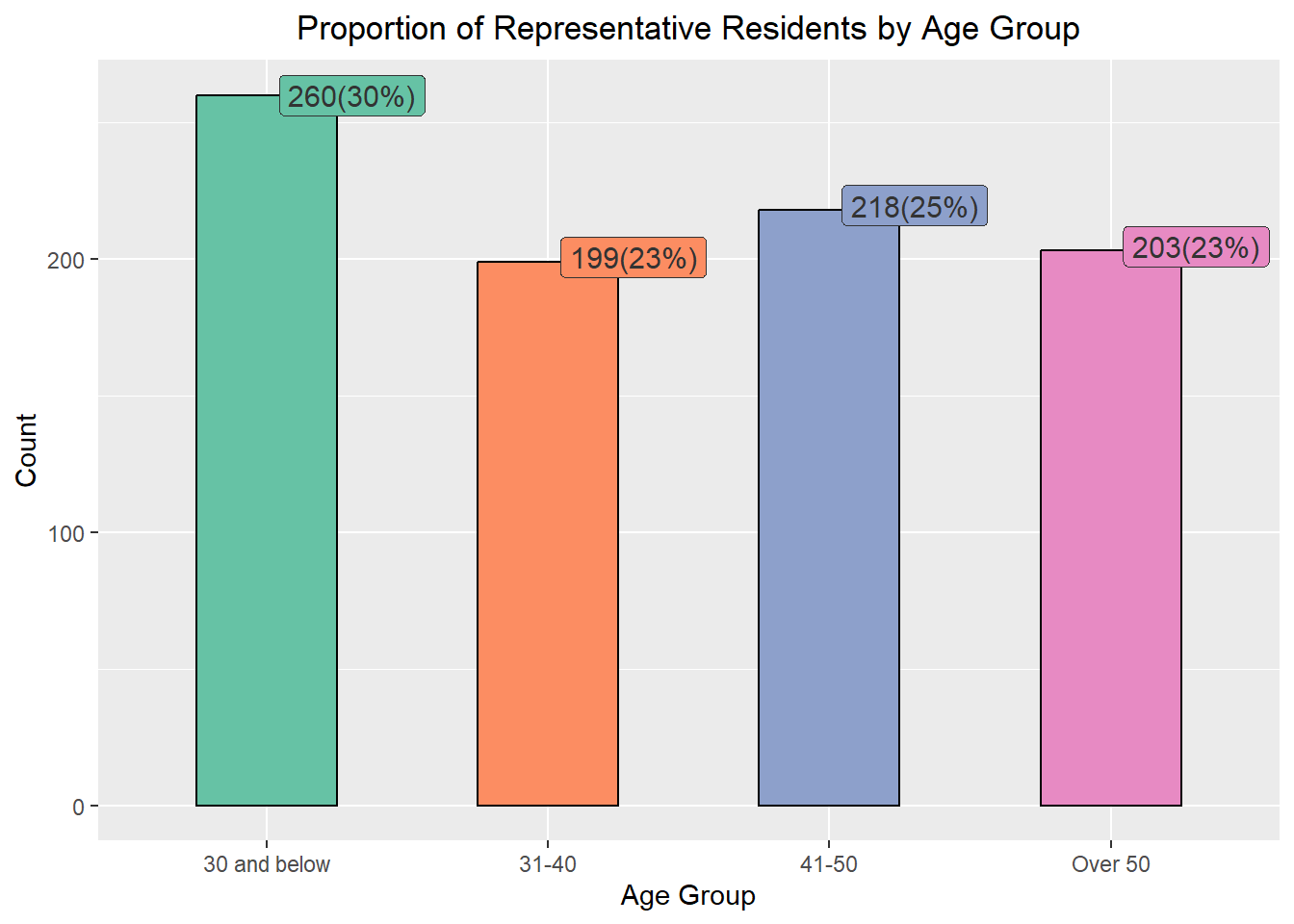
Explanation Based on the information presented, majority (30%) of the representatives are 30 years old or younger while the rest of the age groups were rather evenly distributed.
Design Consideration We make use of bar chart to show the breakdown of the representative residents’ happiness index instead of pie chart to facilitate visual comparison of the different happiness index side-by-side. Besides the % of composition, the number of representative residents with the respective happiness index are also included.
Different colours are also used to represent the different groups of happiness index for easy reference. We also make use of callout extensions above the vertical bars (through ggrepel to show the number of representative residents and the %). The same colour scheme is applied to the callout boxes for easy association. The label of the x-axis ticks were amended for better clarity. In addition, the legend box was excluded as label ticks on the x-axis would have indicated the different groups.
jov_count  <- single_merged_data %>%
  group_by(jov_bin) %>%
  summarize(count = n()) %>%
  mutate(jov_pct = round(count/sum(count)*100)) %>%
  mutate(ypos_p = rev(cumsum(rev(jov_pct))),
         pos_p = jov_pct/2 + lead(ypos_p,1),
         pos_p = if_else(is.na(pos_p), jov_pct/2, pos_p))

ggplot(jov_count,
       aes(x = fct_inorder(jov_bin) , y = count,
           fill = fct_inorder(jov_bin))) +
  geom_bar(stat = "identity", width = 0.5, color = "black") +
  scale_fill_brewer(palette = "Set2") +
  geom_label_repel(data = jov_count,
                   aes(label = paste0(count, "(", jov_pct, "%)")),
                   size = 4, nudge_x = c(0.1, 0.1, 0.1, 0.1, 0.1),
                   nudge_y = c(0.1, 0.1, 0.1, 0.1, 0.1), color = "grey20",
                   show.legend = FALSE) +
  guides(fill = FALSE) +
  labs(title = "Happiness Index of Representative Residents") +
  xlab("Happiness Index (from 0 to 1)") + ylab("Count") +
  scale_x_discrete(labels = c("0.2 and below", "0.21-0.4",
                              "0.41-0.6", "0.61-0.8", "Above 0.8")) +
  theme(plot.title = element_text(hjust = 0.5))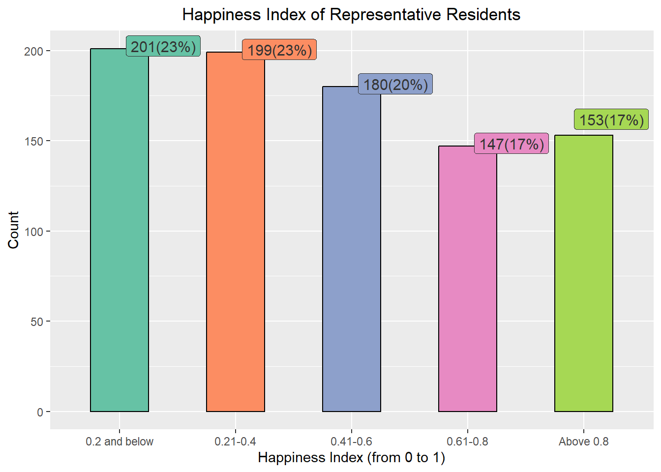
Explanation From the chart above, most of the representative residents (66%) are not very happy (i.e. 0.6 and below), with only 300 out of the 880 representatives (34%) are happy (Happiness Index from 0.61 onwards).
Design Consideration Scatterplots are generally used to show the relationship between two continuous variables.
The original intent was to include more interactive interface by making use DT (data table) and crosstalk packages to allow users to click on a point on the scatterplot to view more information about the selected representative resident. However, the idea was aborted as the points were scattered widely across the x-axis. If we were to include a DT table beside it, the scatterplot will become very small and cramped up. As such, the additional details on the selected representative resident were presented as hovertext instead.
For the graph below, we will compare the Total Income against the Total Savings of the representative residents. Users can select/unselect the different education levels to show on the graph by clicking on the legend on the right side of the chart. The actual total savings and income figures will also be displayed as hovering text when the cursor moves over the points.
fig <- plot_ly(data = single_merged_data,
               type="scatter",
               x = ~Total_sumEarn,
               y = ~Total_saving,
               color = ~educationLevel,
               # Hover text:
               text = ~paste("<br>Age: ", age,
                             "<br>Have Kids?: ", haveKids,
                             "<br>Household Size: ", householdSize,
                             "<br>Total Income: $", Total_sumEarn,
                             "<br>Total Expenses: $", Total_sumExp,
                             "<br>Total Savings: $", Total_saving))

fig <- fig %>%
  layout(title = "\nTotal Income and Savings of Representative Residents\n",
         yaxis = list(zeroline = FALSE, title = "Total Savings ($)\n",
                      titlefont = list(weight = "bold")),
         xaxis = list(zeroline = FALSE, title = "\nTotal Income ($)\n",
                      titlefont = list(weight = "bold")))

fig
Explanation Based on the interactive chart above, we observed participants with higher levels of education tend to earn more and save more, as opposed to those with lower levels of education.
Design Consideration Ridgeline plot is a set of overlapped density plots, which could help us compare distributions of the dataset. They are useful for visualizing changes in distributions over time. As such, we will make use of such plots to present 3 sets of information for the period of study (i.e. Mar 2022 to Feb 2023).
ggplot(data = expanded_merged_data,
       aes(x = sum_earning, y = educationLevel, fill = after_stat(x))) +

  geom_density_ridges_gradient(scale = 3, rel_min_height = 0.01) +

  theme_minimal() +

    labs(title = 'Total Income by Education Level: {frame_time}',
       y = "Education Level",
       x = "Total Income") +

  theme(legend.position="none",
  text = element_text(family = "Arial"),
  plot.title = element_text(face = "bold", size = 12),

  axis.title.x = element_text(size = 10, hjust = 1),
  axis.title.y = element_text(size = 10, angle = 360, vjust=1),
  axis.text = element_text(size = 8)) +

  scale_fill_viridis(name = "sum_earning", option = "H") +

  transition_time(expanded_merged_data$YearMth) +
  ease_aes('linear')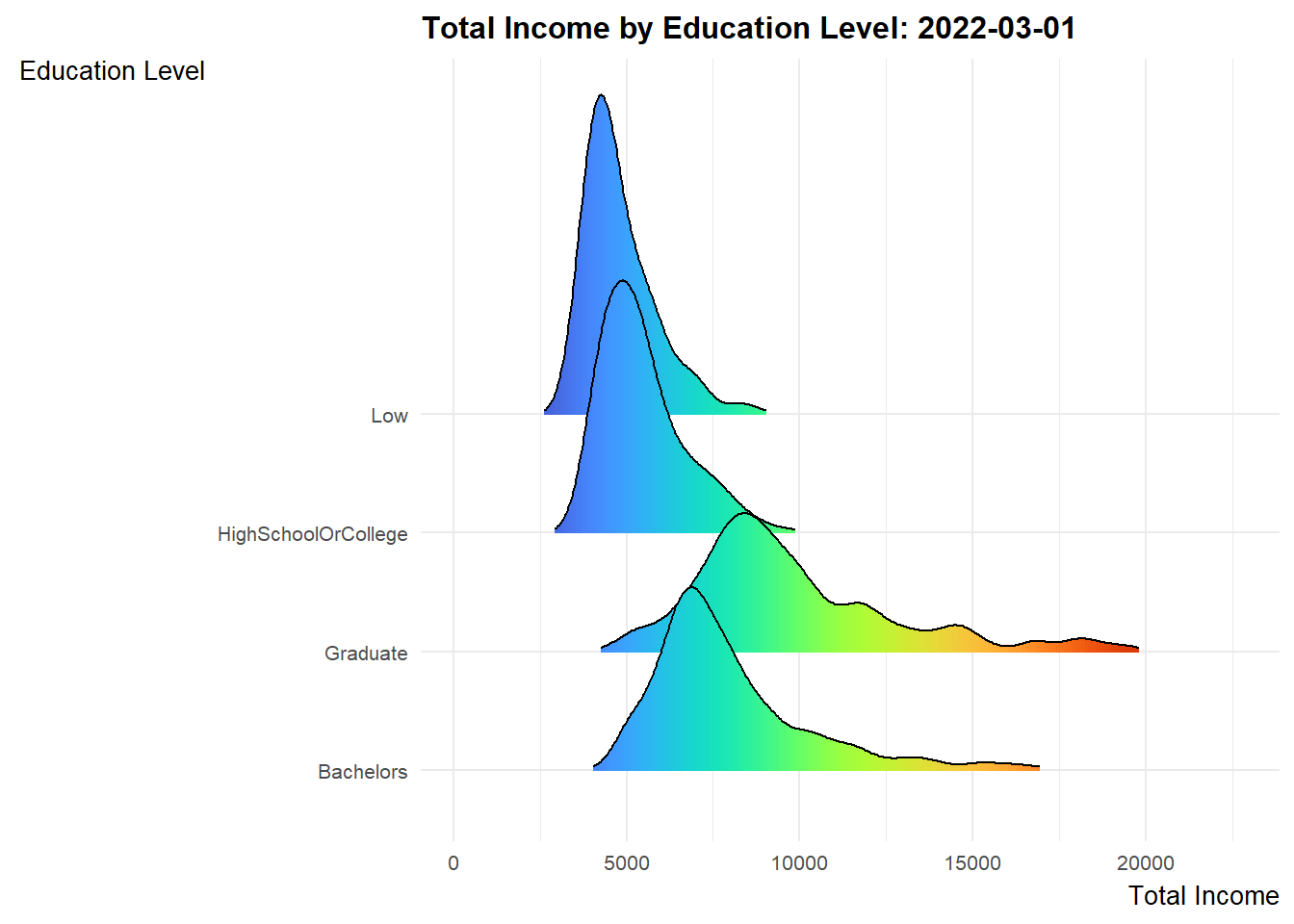
Explanation
ggplot(data = expanded_merged_data,
       aes(x = sum_expense, y = educationLevel, fill = after_stat(x))) +

  geom_density_ridges_gradient(scale = 3, rel_min_height = 0.01) +

  theme_minimal() +

    labs(title = 'Total Expenditures by Education Level: {frame_time}',
       y = "Education Level",
       x = "Total Expenditure") +

  theme(legend.position="none",
  text = element_text(family = "Arial"),
  plot.title = element_text(face = "bold", size = 12),

  axis.title.x = element_text(face = "bold", size = 10, hjust = 1),
  axis.title.y = element_text(face = "bold", size = 10, angle = 360, vjust=1),
  axis.text = element_text(size = 8)) +

  scale_fill_viridis(name = "sum_expense", option = "C") +

  transition_time(expanded_merged_data$YearMth) +
  ease_aes('linear')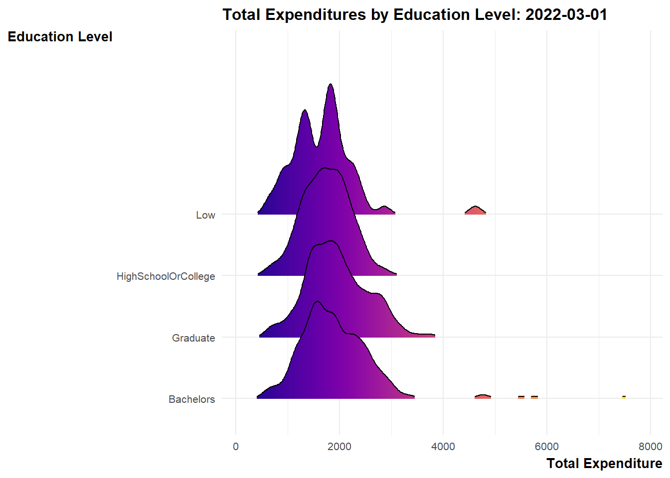
Explanation
Design Consideration We use an interactive scatterplot to analyse the monthly income with the spending of the representative residents on a monthly basis.
For the graph below, the x-axis represents the monthly income, while the y-axis shows the monthly expense as a percentage (over the monthly income). The label ticks of y-axis was intentionally left to exceed 100% (anything over 100% will imply that the resident overspent for that particular month. Different colours of the bubbles are used to represent the different education levels. Additional information such as the Age, Household Size and whether the resident has kids will also be shown when the user mouseover the points.
bp <- expanded_merged_data %>%
  plot_ly(x = ~sum_earning,
          y = ~expense_percent,
          sizes = c(2, 100),
          color = ~educationLevel,
          frame = ~YearMonth,
          text = ~paste("<br>Representative Resident Id: ", participantId,
                        "<br>Age: ", age,
                        "<br>Education Level: ", educationLevel,
                        "<br>Have Kids: ", haveKids,
                        "<br>Household Size: ", householdSize,
                        "<br>Monthly Income: $", sum_earning,
                        "<br>Monthly Expense: $", sum_expense,
                        "<br>% of Monthly Income Spent: ", expense_percent, "%"),
          hoverinfo = "text",
          type = 'scatter',
          mode = 'markers'
          ) %>%
  layout(title = list(text= "\nMonthly Income vs % of Monthly Income Spent\n",
                      weight="bold"),
         xaxis = list(title = "\nMonthly Income",
                      titlefont = list(weight = "bold")),
         yaxis = list(title = "% of Monthly Expenses over Income\n",
                      titlefont = list(weight = "bold")),
         showlegend = FALSE)
bp
Explanation From the graph, it appeared that there were some overspendings among the residents across the months. These residents typically belong to the lower education groups.
The objective of a two-sample mean test is to compare the means of two independent samples and determine if they are significantly different from each other.
ggbetweenstats(
  data = single_merged_data,
  x = haveKids,
  y = Total_sumExp,
  type = "np",
  messages = FALSE
) +
  ylab("\nTotal Expenditure") +
  xlab("\nHave Kids?") +
  ggtitle("Total Expenditure of Representative Resides without and with Kids\n") +
theme(plot.title = element_text(hjust = 0.5)) 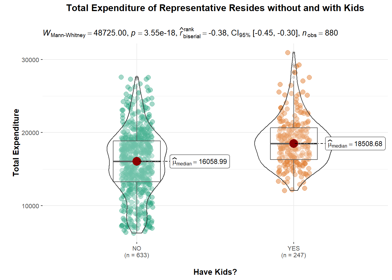
Explanation The above violin plot shows that 247 representative residents with kids tend to spend more (approximately $2450) compared to the remaining 633 without kids.
Since the p-value is very small (less than the significance level of 0.05), we can reject the null hypothesis that having kids will result in higher expenditure and conclude that there is a significant difference between the means of the two samples.
However, we also noted that \(\hat{r}\) value of -0.38 would indicate a moderate negative correlation between the two samples. This suggests that there may be a relationship between the samples, such that as one sample increases, the other sample decreases.
One-Way ANOVA (Analysis of Variance) test is used to determine whether there is a statistically significant difference between the means of three or more independent groups. The purpose of conducting a One-Way ANOVA test is to determine whether the variation in the response variable (dependent variable) is due to the variation in the factor being tested (independent variable) or whether it is simply due to chance.
We will conduct a One-Way ANOVA test on the Total Expenditures (dependent variable) with different levels of education (independent variable).
ggbetweenstats(
  data = single_merged_data,
  x = educationLevel,
  y = Total_sumExp,
  type = "np",
  mean.ci = TRUE,
  pairwise.comparisons = TRUE,
  pairwise.display = "s",
  p.adjust.method = "fdr",
  messages = FALSE) +

  ggtitle("One-Way ANOVA Test for Total Expenditure by Education Level\n") +
  theme(plot.title = element_text(hjust = 0.5)) +
  xlab("\nEducation Level") +
  ylab("Total Expenditure\n")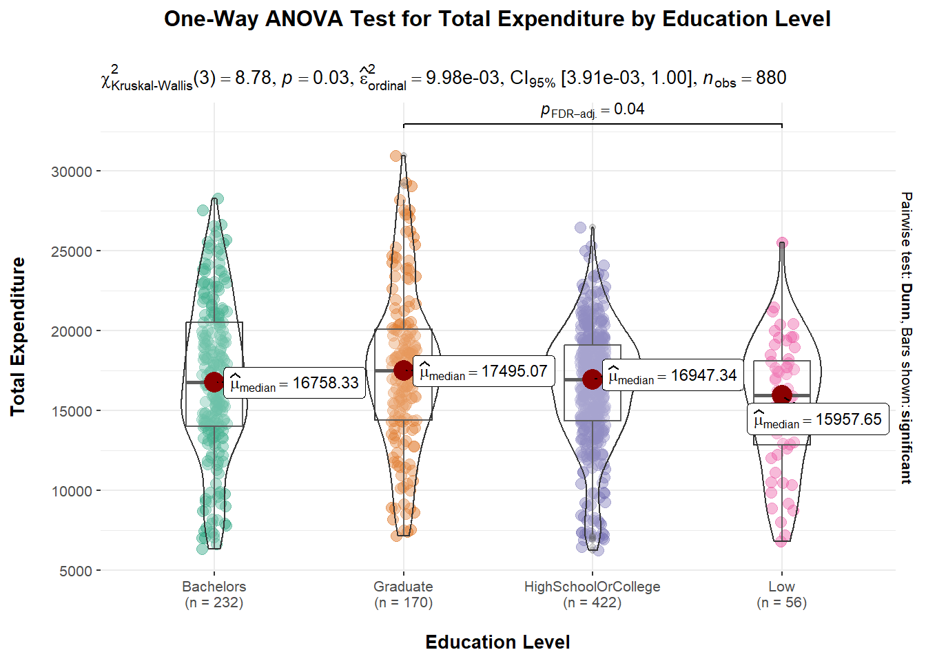
Explanation A p-value of 0.03 means that there is a 3% probability of obtaining a test statistic as extreme or more extreme than the one observed, assuming the null hypothesis is true. This suggests that there is some evidence against the null hypothesis and that the observed differences in means between the groups may be statistically significant. It is also observed that the median values are slightly different across the different education levels.
Correlation tests are performed to investigate the strength and direction of a relationship between two variables. It helps to determine if the variables are related and, if so, how strongly they are related. As such, we will conduct 2 correlation tests here. The first correlation test will look at the relationship between Total Income and Total Savings; the second correlation test will examine the relationship between Age and Wages.
As we have seen in Section 4.1.2 (Total Income and Savings with reference to Education Level), it seems that the more income a representative resident earn, the more he/she saves. We will examine the correlation coefficient to see if this is indeed true.
ggscatterstats(data = single_merged_data,
               x = Total_sumEarn,
               y = Total_saving,
               marginal = FALSE) +
  theme_minimal() +
  labs(title="Correlation of Total Income and Savings",
       x = "Total Income",
       y = "Total Savings") +

  theme(text = element_text(family = "Arial"),
        plot.title = element_text(hjust = 0.2, size = 15, face = 'bold'),
        plot.margin = margin(20, 20, 20, 20),
        legend.position = "bottom",
        axis.text = element_text(size = 10, face = "bold"),
axis.title = element_text(size = 12, face = "bold")) 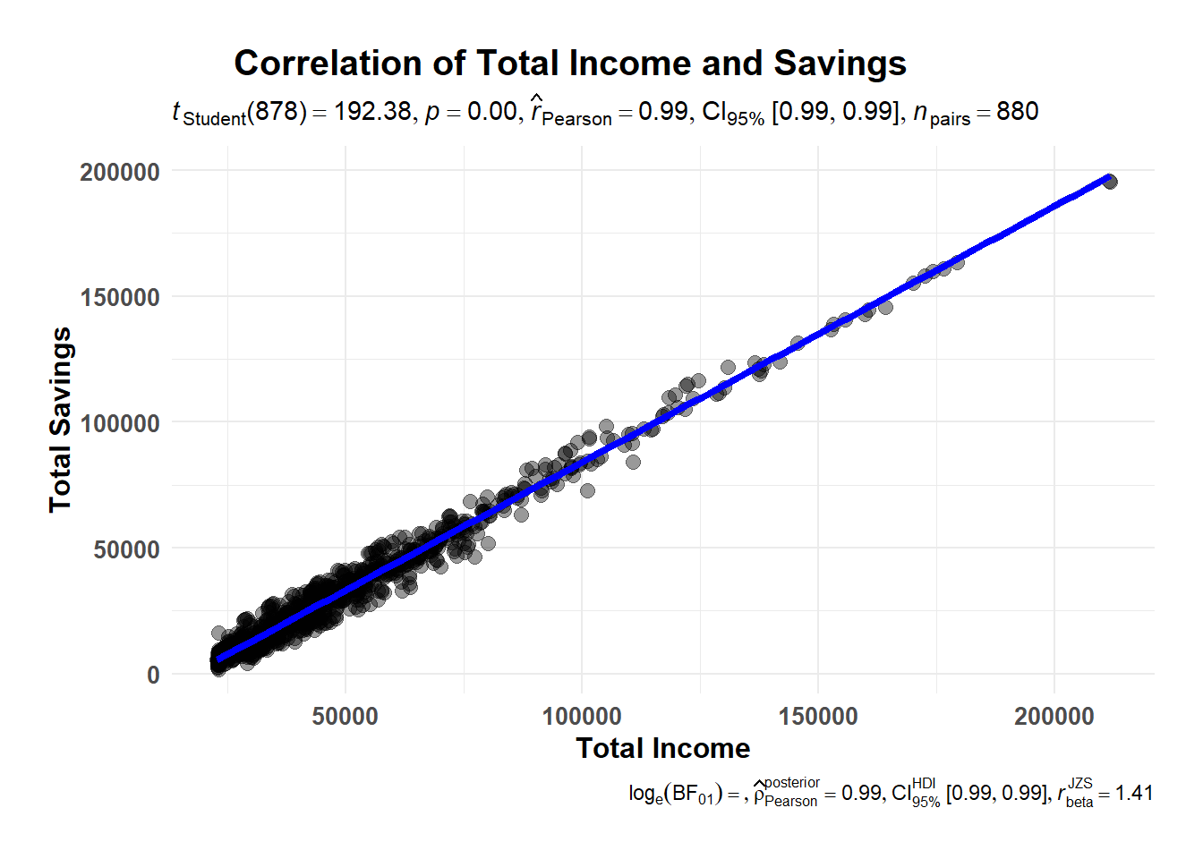
Explanation With a \(\hat{r}\) value of 0.99, it indicates that there is a very strong positive linear relationship between the Total Income and Total Savings (more income, more savings).
ggscatterstats(data = single_merged_data,
               x = age,
               y = Total_Wage,
               marginal = FALSE) +
  theme_minimal() +
  labs(title="Correlation of Total Wages and Age",
       x = "Age",
       y = "Total wage") +

  theme(text = element_text(family = "Arial"),
        plot.title = element_text(hjust = 0.2, size = 15, face = 'bold'),
        plot.margin = margin(20, 20, 20, 20),
        legend.position = "bottom",
        axis.text = element_text(size = 10, face = "bold"),
        axis.title = element_text(size = 12, face = "bold"))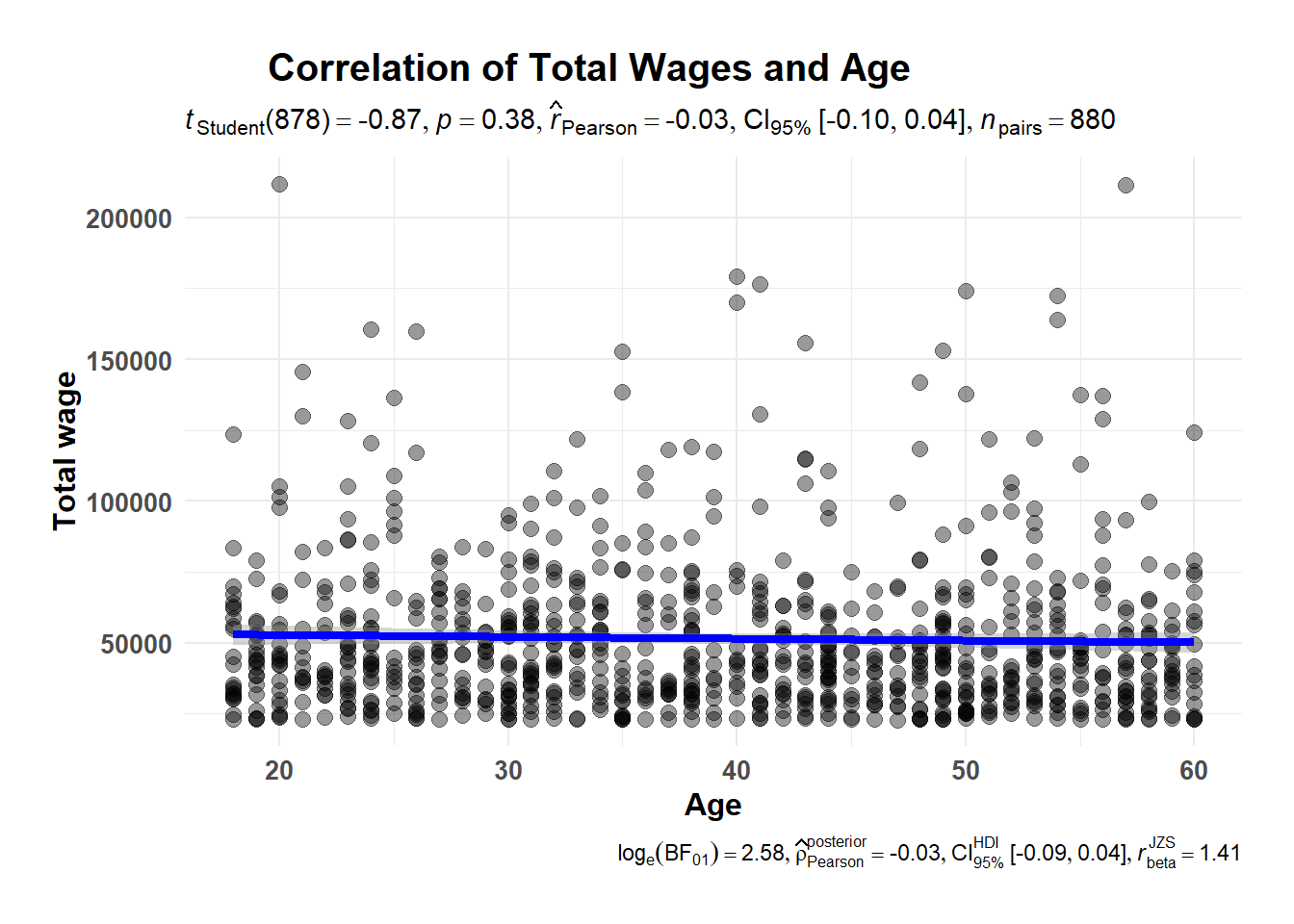
Explanation Given that the \(\hat{r}\) value is -0.03, there is weak negative correlation between the Age and Wage. This means that as the age increases, the wage tends to decrease, even though the relationship is not very strong.